Buttons
Buttons allow users to take actions, and make choices, with a single click.
Interactive demo
TextButton
IconButton
IconToggle
ToggleButton
Usage
Buttons communicate actions that users can take. They are typically placed throughout your UI, in places like:
- Dialogs
- Workspace
- Forms
- Cards
- Toolbars
Principles
Identifiable: Buttons should indicate that they can trigger an action.
Findable: Buttons should be easy to find among other elements, including other buttons.
Clear: A button's action and state should be clear (hovered, selected, clicked, and disabled).
Anatomy
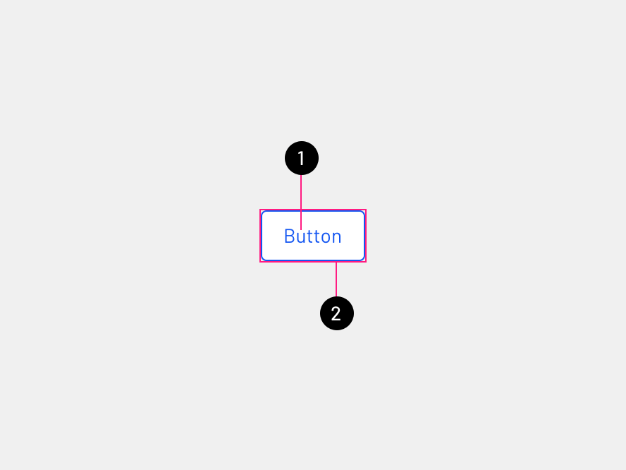
Outlined button
- Text label: Describe the button action.
- Container: Hold all button elements, and their size is determined by the space those elements occupy.
Contained button
- Text label: Describe the button action.
- Container: Hold all button elements, and their size is determined by the space those elements occupy.
Icon button
- Icon: Illustrate the button action.
- Container: Hold all button elements, and their size is determined by the space those elements occupy.
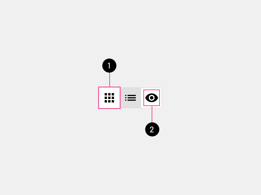
Toggle button
- Container: Hold all button elements, and their size is determined by the space those elements occupy.
- Icon: Illustrate the button action.
Text label
Outlined buttons and Contained buttons use text labels, which describe the action that will occur if a user clicks a button. Text for the button should not wrap and should remain on a single line.
Icons and Text
Buttons should not use both an icon and a text label, use either a Text button or Icon button. To create a consistent look between products, buttons will have either a text label or an icon, to avoid some products using a lot of buttons with text and icons and other products using only text or icon. Text labels should be descriptive enough so icons are not needed. Icon buttons take less space which can be used in tight areas.
Hierarchy
A single, prominent button
A layout should contain a single prominent button that makes it clear that other buttons have less importance.
Other buttons
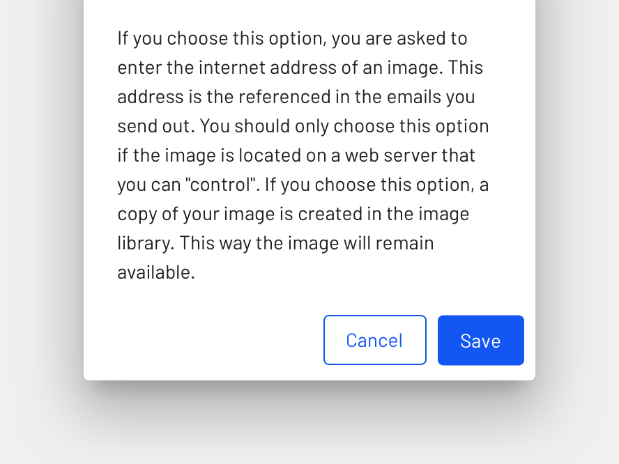
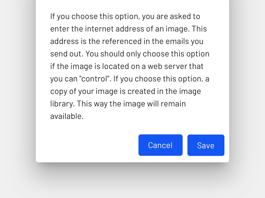
A product can show more than one button in a layout at a time, Contained button can be accompanied by an Outlined button that performs less important actions. When using multiple buttons, ensure the available state of one button doesn't look like the disabled state of another.
Placement
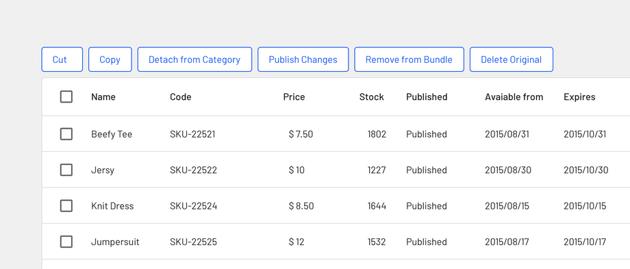
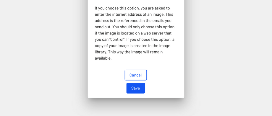
When using multiple buttons where the user can only take one action, indicate the more important action by placing it in a Contained button (next to an Outlined button).
States
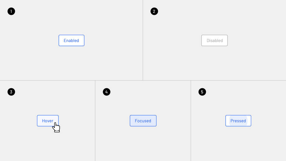
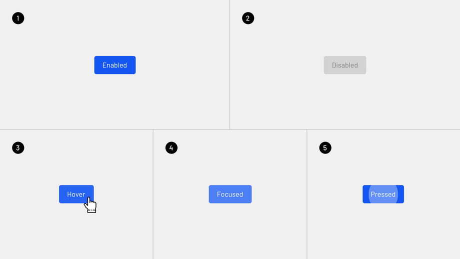
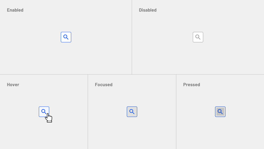
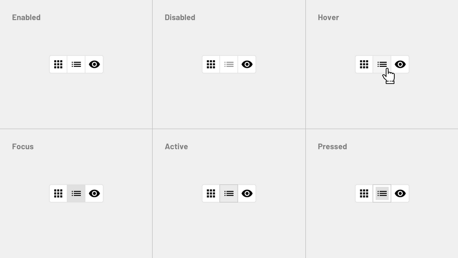
Each button, has 5 or 6 different states.
Enabled
An enabled state communicates an interactive component or element.
Disabled
A disabled state communicates a non-interactive component or element.
Hover
A hover state communicates when a user has placed a cursor above an interactive element.
Focused
A focused state communicates when a user has highlighted an element, using an input method such as a keyboard.
Pressed
A pressed state communicates a user click.
Active
An activated state communicates a highlighted destination, whether initiated by the user or by default.
Types
Outlined button
Usage
They contain actions that are important but aren't the product's primary action.
Outlined buttons have medium emphasis due to the stroke.
Container
In a resting state, Outlined buttons should display containment with a stroke and no fill. An Outlined button's width is dynamically set to fit the text label.
States
Contained button
Usage
They contain actions that are primary to your product.
Contained buttons have high emphasis, as they use a color fill.
Container
Contained buttons display containers with a solid color, a button container's width shouldn't be shorter than its text.
States
Icon button
Usage
Icon buttons contain important actions.
Icon buttons have medium emphasis due to the stroke.
Icons
Icons used must clearly communicate their meaning. Universal icons should be used to avoid the cultural barrier. Use a single icon set and ensure that all icons are consistent and cohesive.
States
Toggle button
Usage
Toggle buttons can be used to group related options. To emphasize groups of related Toggle buttons, a group should share a common container.
Toggle buttons is a set of actions using layout and spacing. They're used less often than other button types.
Selected action
Only one option in a group of Toggle buttons can be selected and active at a time. Selecting one option deselects any other.
One of the Toggle button options always has to be selected.
States
Variations
The text button has two variations (outlined and contained). Outlined is the default.
Specs
Outlined button
- Border-color:
color-primary-500.
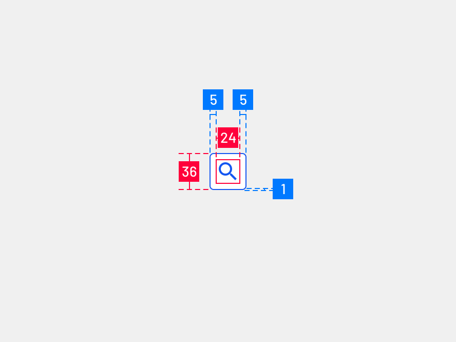
Icon button
- Interactive demo
- TextButton
- IconButton
- IconToggle
- ToggleButton
- Usage
- Principles
- Anatomy
- Outlined button
- Contained button
- Icon button
- Toggle button
- Hierarchy
- A single, prominent button
- Other buttons
- Placement
- States
- Enabled
- Disabled
- Hover
- Focused
- Pressed
- Active
- Types
- Outlined button
- Contained button
- Icon button
- Toggle button
- Variations
- Specs
- Outlined button
- Icon button
