Cards
Cards contain content and actions about a single subject.
Interactive demo
Card
ExpandableCard
Usage
Cards are surfaces that display content and actions on a single topic.
They should be easy to scan for relevant and actionable information. Elements, like text and images, should be placed on them in a way that clearly indicates hierarchy.
Principles
Contained: A card is identifiable as a single, contained unit.
Independent: A card can stand alone, without relying on surrounding elements for context.
Individual: A card cannot merge with another card, or divide into multiple cards.
Anatomy
Card layouts can vary to support the types of content they contain. The following are the anatomy for two types of cards.
Simple Card

- Container: Card containers hold all card elements, and their size is determined by the space those elements occupy. Card elevation is expressed by the container.
- Header text (optional): Header text can include things like the name of a photo album or article.
- Content area: Cards can include a variety of content like graphs, forms, and media.
- Buttons (optional): Cards can include buttons for actions.
- Overflow menu (optional): Cards can include icons for actions.
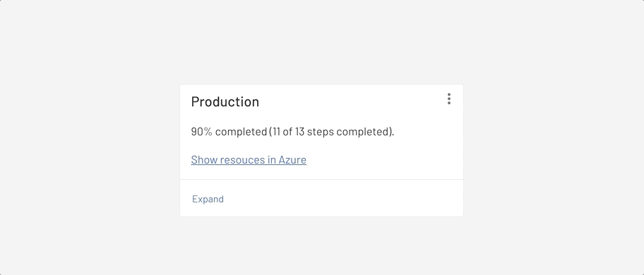
Expandable Card

- Container: Card containers hold all card elements, and their size is determined by the space those elements occupy. Card elevation is expressed by the container.
- Header text (optional): Header text can include things like the name of a photo album or article.
- Content area: Cards can include a variety of content like graphs, forms, and media.
- Expand & Collapse button: Cards can have expandable content area.
- Overflow menu (optional): Cards can include icons for actions.
- Divider: Cards should have a full-width divider indicating the area that can be expanded.
Each card is made up of content blocks. All of the blocks, as a whole, are related to a single subject or destination. Content can receive different levels of emphasis, depending on its level of hierarchy.
Behavior
Elevation
By default, cards have a resting elevation of 0dp. They elevate to 1dp on hover, with a raised dragged elevation of 8dp.

Placement
Usage
When multiple cards are present, they are grouped together into one or more collections. By default, cards in a collection are coplanar, sharing the same resting elevation unless they are picked up or dragged.

Layout
Organize card collections so that they are easy to use. Their layout affects how they are perceived.

When adding cards to a collection, the first item is automatically positioned on the top left. Subsequent cards are laid out left to right, top to bottom.
Scannable
To make a collection of cards scannable, place them in a consistent pattern.


States
Empty states
To keep the user informed, an empty card with a height of 88px should be displayed during an empty state while waiting for content to load. The width is unaffected and follows the Specs.
Actions

Overflow menus should be located in the upper-right corner(1) of a card.
UI controls
UI controls can be included within a card to allow the user to interact with a card's content. UI controls may be in the form of a slider, stars to rate content, chips, or buttons.

Focus
When traversing through focus points on a card, visit each focused element before moving to the next card.
For users that navigate solely using focus traversal (using a D-pad and keyboard), cards should have either a primary action or open a new screen containing primary and supplemental actions.
Types
Simple cards
Simple cards follows the basic anatomy of Cards which has a static container size.
Expandable cards
Expandable cards includes extensible container. Content that can be expanded should use full-width dividers.
Specs
The minimum width of Card should be 280px. This width supports 3 columns of large Page layout, and 4 columns of medium Page layout.
Overflow icon button
The overflow icon button is an Outlined Icon Button that has a "more-vert" 24x24px icon with no background or border around it, but it has same ripple effects (hover, active... etc) as Outlined Icon Button. Overflow icon button is positioned at the top right corner of the Card with 8px paddings from the top and right side of the Card container.
Expand & Collapse button
This button is Card specific button, it has the same height and ripple effects as other Buttons, the only difference is that this button has only text and no outline or background color.
Padding
- 32px between the top of the Container and bottom of Header text
- 16px between Header text and Content
- 16px between the left side of the Container and Header text
- 16px between the left side of the Container and Content area
- 8px between the top of the Container and Overflow menu
- 8px between the right side of the Container and Overflow menu
- 16px between the right side of the Container and Content area
Paddings for buttons
- 16px between Content area and Buttons
- 8px between Buttons and bottom of Container
- 8px between the left side of the Container and Buttons
Paddings for Expand & Collapse button
- 16px between Content area and Divider
- 8px between Divider and Expand & Collapse button
- 8px between Expand & Collapse button and bottom of the Container
- 8px between the left side of the Container and Expand & Collapse button