Tabs
Tabs organize content across different screens, data sets, and other interactions.
Interactive demo
Usage
Tabs organize and allow navigation between groups of content that are related and at the same level of the hierarchy.
Principles
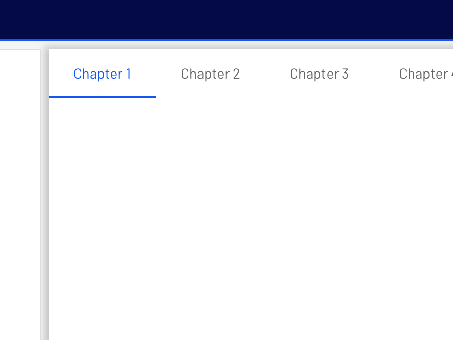
Scalable: As tabs can horizontally scroll, a UI can have as many tabs as needed.
Informative: Tabs organize content into categories to help users easily find different types of information.
Peers: Tabs are displayed next to each other as peers, in categories of equal importance.
Tabs in a set
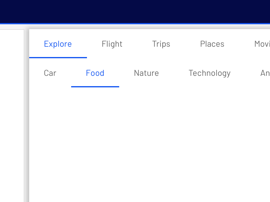
Each tab should contain content that is distinct from other tabs in a set. For example, tabs can present different sections of news, different genres of music, or different themes of documents.
Anatomy
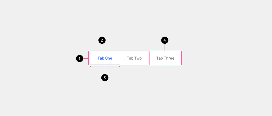
- Tab bar: Holds all tabs elements, and their size is evenly distributed.
- Active text label: Show the selected state with primary color.
- Active tab indicator: Show an indicator to make active state visible without relying on color for accessibility.
- Tab: This is a tab item that the user can select.
Text label
Text labels should clearly and succinctly describe the content of the tab they represent. Tab content should contain a cohesive set of items that share a common characteristic.
Tab labels appear in a single row.
Active tab indicators
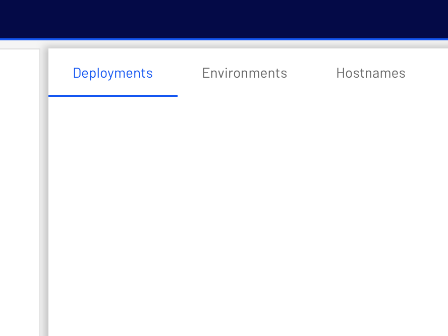
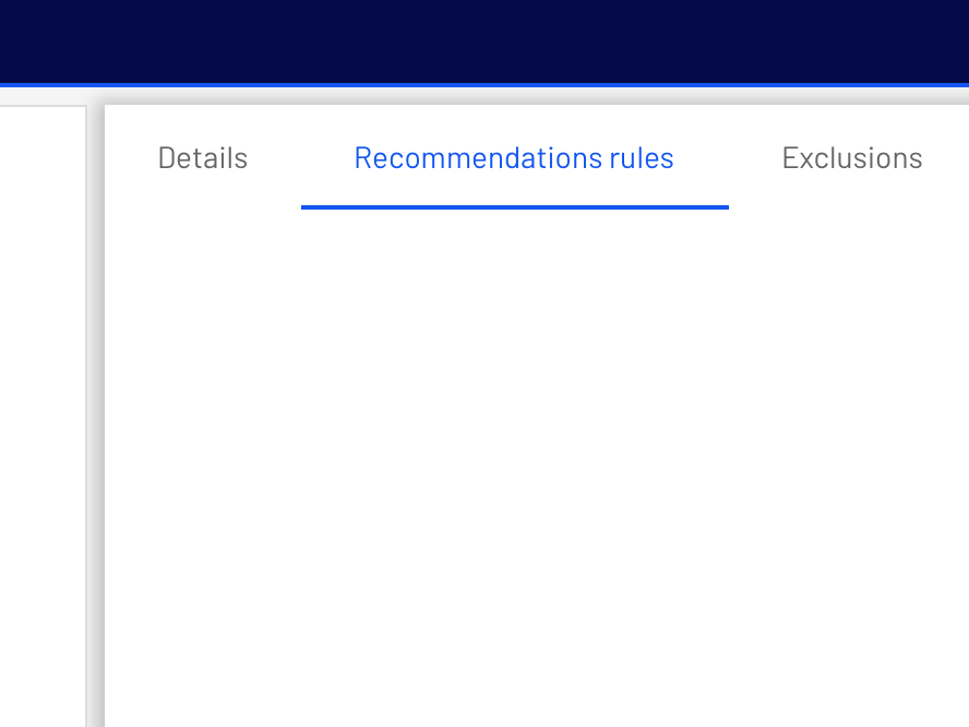
To differentiate an active tab from an inactive tab, apply an underline and color change to the active tab's text. An underline and color change differentiate an active tab from the inactive ones.
Behavior
Moving between tabs
Users can navigate between tabs by clicking a tab.
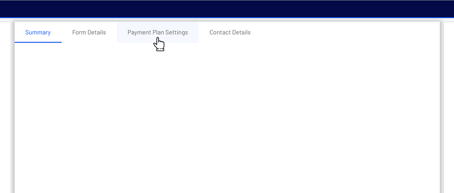
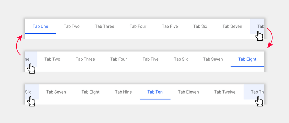
To navigate between tabs, click on the individual tab. The tab container should always be left-aligned.
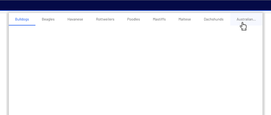
The tabs will remain hidden until scrolled, to scroll between tabs use:
- Trackpad by swiping left/right.
- Shift + mouse wheel.
Placement
Tab layout
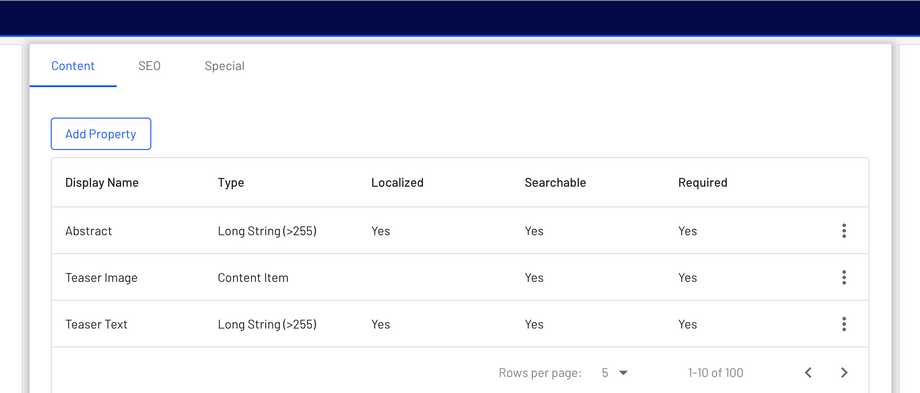
Tabs are displayed in a single row, with each tab connected to the content it represents. As a set, all tabs are unified by a shared topic.
Tab placement
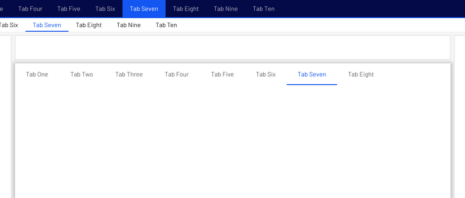
Tabs can be nested into components such as Platform Navigation or cards.
Tabs control the UI region displayed below them.
Don't place tabs above content that they don't control. If tabs only change a section of the UI, embed them within that section.
States
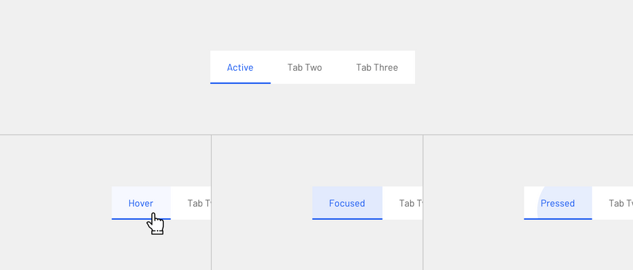
By default, tabs inherit enabled states with one active state.
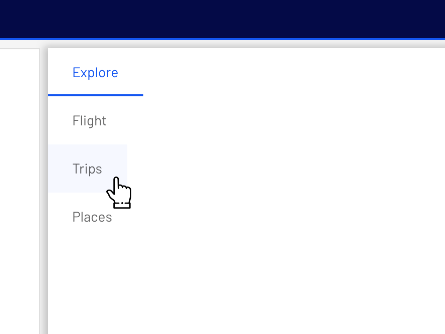
The inactive state of a tab can inherit a hover, focus, and clicked state.
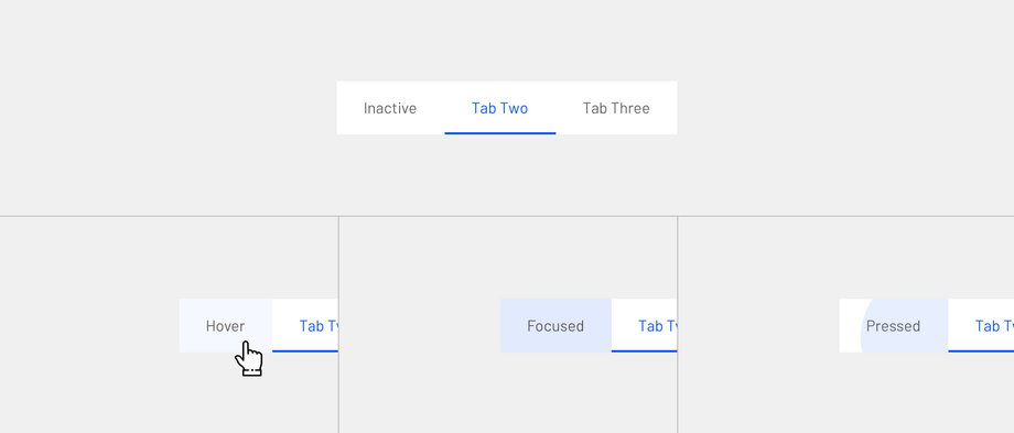
The active state of a tab can inherit a hover, focus, and clicked state.
Specs
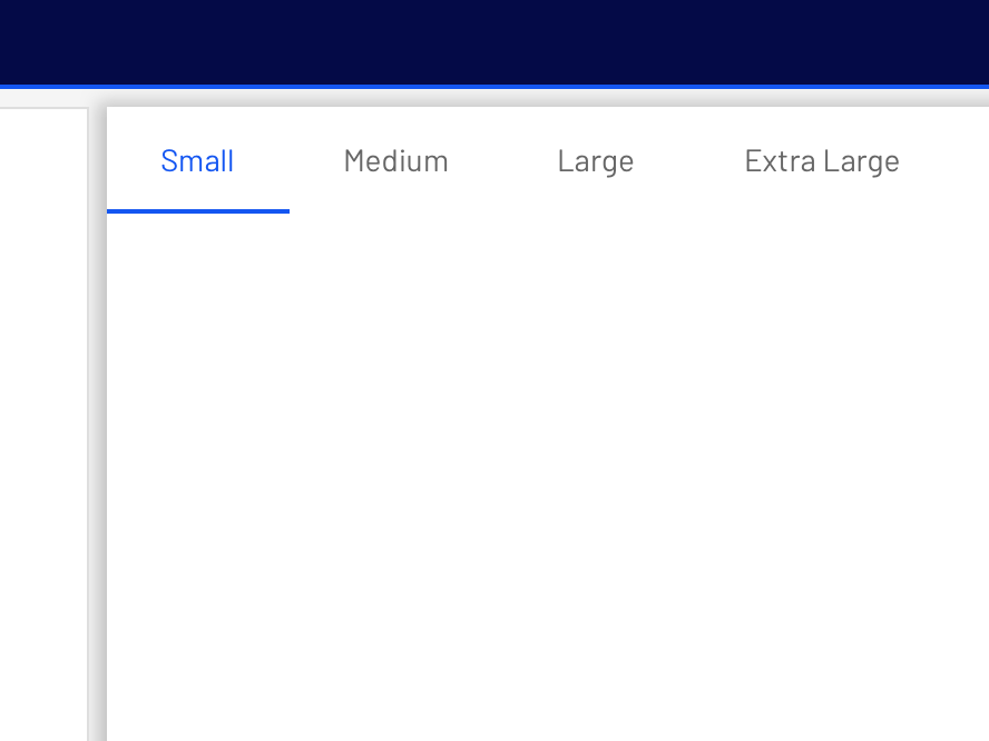
The width of each tab is determined by the text label's width in addition to 24px padding on left and right side.
- Interactive demo
- Usage
- Principles
- Tabs in a set
- Anatomy
- Text label
- Active tab indicators
- Behavior
- Moving between tabs
- Placement
- Tab layout
- Tab placement
- States
- Specs
