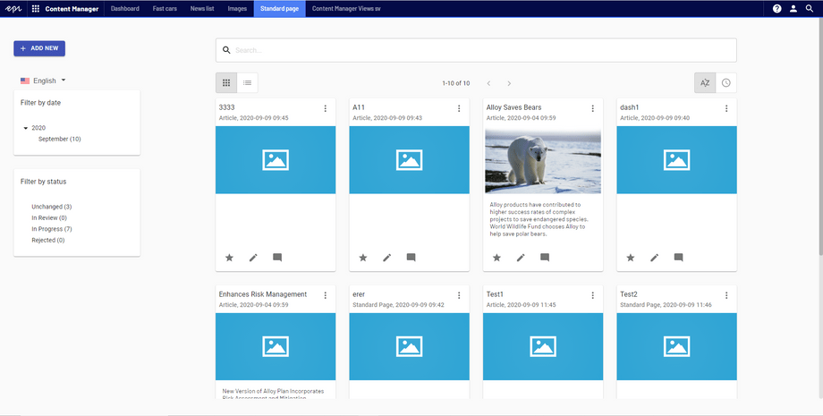
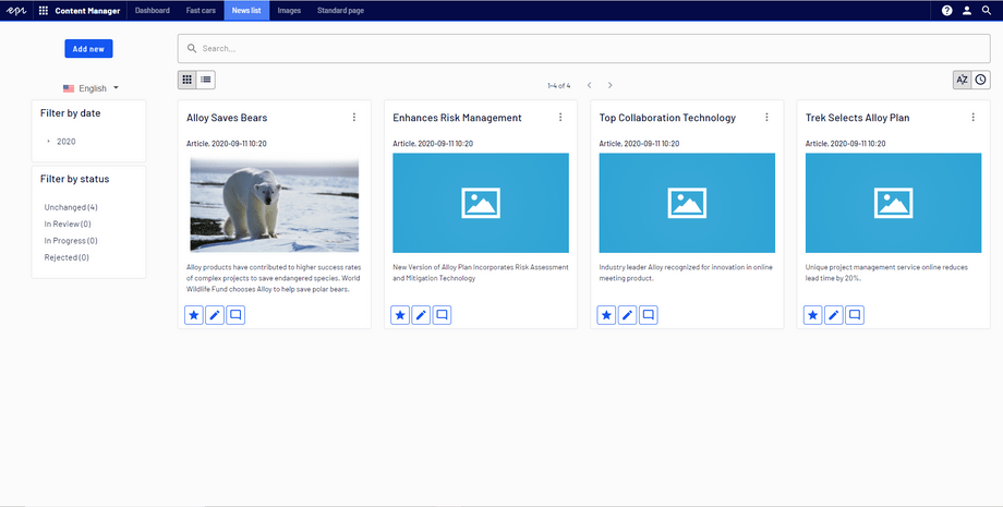
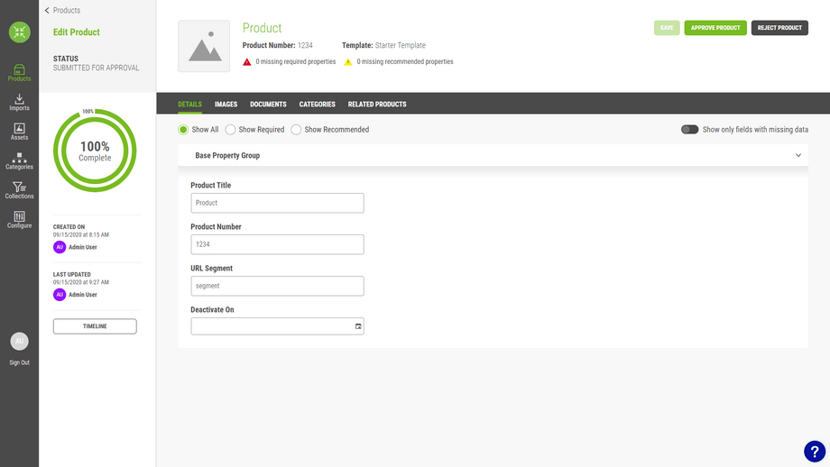
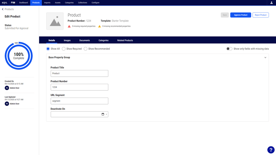
UI Refresh
One of the first things you will notice when starting to use the Platform Navigation component is that it can look out of place next to all your existing components and styles.
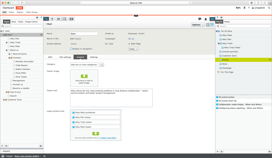
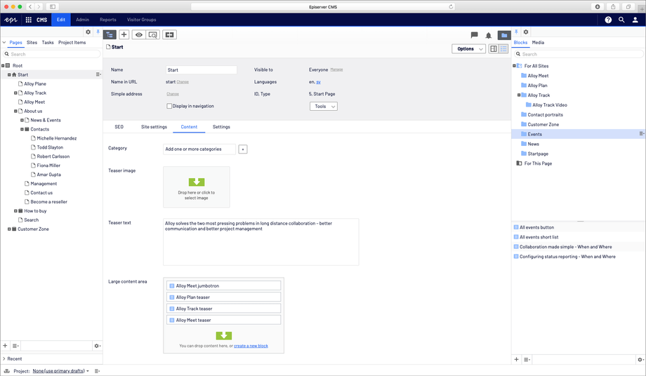
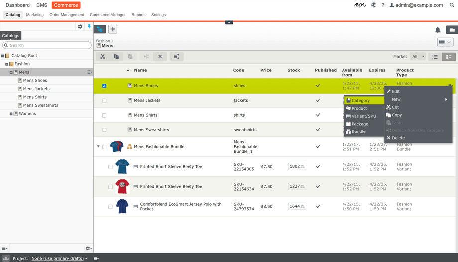
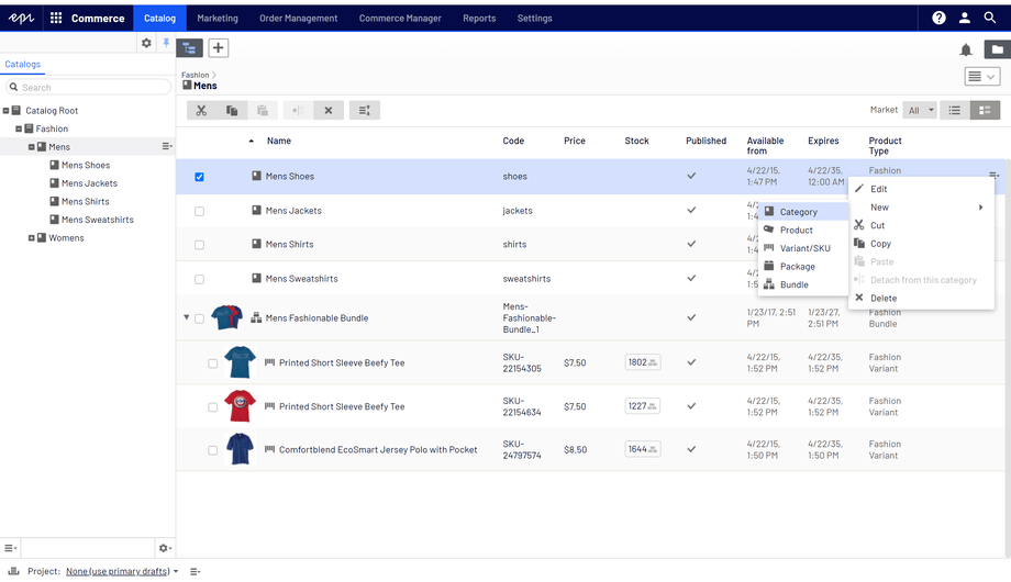
In order to fix this issue without rebuilding the UI from scratch, the CMS UI team decided to set some time aside to do a UI refresh. The goal was to make big impact changes with a one month timebox to keep them from getting caught up in minor details. This page documents their tips from that period.
Important: Style the places that has the most visual impact to the user.
Main changes
- Font family is changed to Barlow
- Primary color used for selected states
- Border radius for buttons, text fields, etc is
4px - All gradients are replaced with flat colors
For inspiration you can turn to the UI Framework.
Color
- values: reference Variables page
- backgrounds:
color-surface-050 - border:
color-surface-400 - text:
color-primary-900 - Gradients: remove them
Changing from a white or orange top menu is a large shift in terms of color. CMS UI, and to some extent Find, use a color palette with at least three main colors (green, orange, and blue). The Design System keeps things simpler with one primary color and its variants.
Use a color-primary-500 background color for higher priority things such as active and focused borders, and confirmation buttons. A softer choice, color-primary-100 can be used for currently selected content. color-primary-050 takes that softness a step further for selected, but not focused content.
In CMS UI, the main color changes were:
- Changing the login screen to use
color-primary-500instead of the Episerver orange.- Using the new Success, Error, Reminder, and Warning palettes.
- Replacing many of the gray colors in the UI with our new Surface palette.
- Removing most of the "inverted" styles (white on black).
- Standardizing many of the text colors to a primary color (
color-primary-900), and a lighter, secondary color (color-surface-800).- Removing background images and gradients, replacing them with flat colors (usually
color-surface-050) made an immediate difference.
Font
- color:
color-primary-900 - family: Barlow
- size:
14px - font-weight:
400
In CMS UI, the font size is slightly bigger than previous font, and this size increase caused some instances where the extra height pushed something else slightly out of view, such as a border. These small adjustments need to be handled on an individual basis, but can usually be solved with a simple padding adjustment.
In CMS UI, the font weight for buttons and other components is
500, we also included bold font-weight (700).
As mentioned in the color section, try to standardize the font color to two shades. There can be a few old colors lurking about, but the important thing is that the main portions of the UI are using those colors.
Borders
- color:
color-surface-400 - radius:
2px - style: solid
- width:
1px
The most apparent change to borders is to remove them as separators.
In CMS UI, borders used to be found in the content trees, tables, and some menus.
Not every separator needs to be removed, but minimizing their usage when possible offers a cleaner, more modern look.
Icons
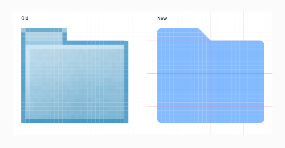
Icons are likely designed to fit existing components. Changing them too much can cause positioning issues in for example buttons. This means it's enough to only change colors and borders. Colors of icons should be selected from the color palette (without using gradients), and corners of the icons should have 1px radius.
In CMS UI, to achieve a more modern look, we needed to redesign some of the icons, and based them on Material Design icons. It is really important that any "new icons" cover the same amount of space in pixel grid as the "old icon". This avoids visual effects of extra padding between an icon and a component. Also make sure that new icons are designed according to a pixel grid, otherwise they will look "blurry" when exported.
Common components
Panels
- background:
color-surface-050 - border:
1pxsolidcolor-surface-400 - Border between menu items is set to be transparent, if we remove it all items will move for 1px
Menus
- selected active / background:
color-primary-100 - selected inactive / background:
color-primary-050
Context Menus
- Are elevated with a shadow
- No borders
- CSS:
box-shadow: 0 4px 10px -3px rgba(0,0,0,.2), 0 8px 6px -10px rgba(0,0,0,.14), 0 3px 6px 2px rgba(0,0,0,.12)
- padding: 4px 8px 4px 8px (give icons and text some space)
- hover / background:
color-primary-100
Graphs
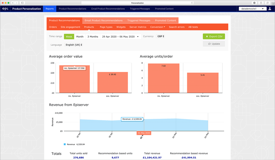
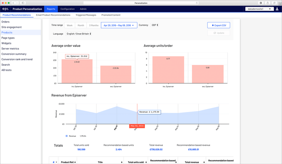
In current Personalization, the main two graphs are:
- Grouped bar chart:
color-secondary-200 - Area chart:
color-primary-300
Tooltips
Labels are shown when the user hovers over the graph.
- background:
color-surface-050 - opacity:
1 - border: same color as the graph
- text-color: black
Hover line with the label
Line with the label is showed when the user hovers over the graph.
- border-color:
color-secondary-500 - background:
color-secondary-500 - text-color:
color-surface-050
References
CMS
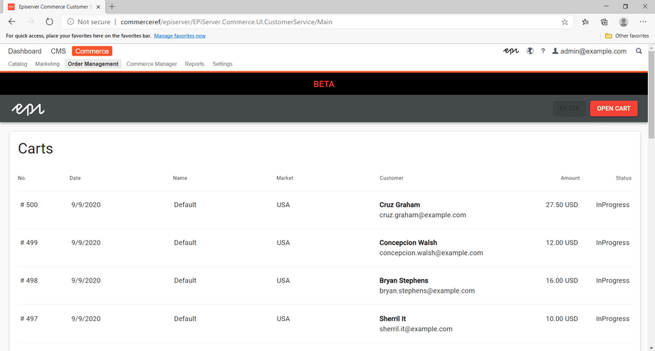
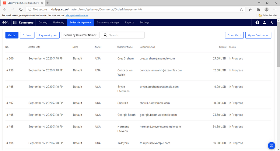
Commerce
Personalization
CSR
Content Manager
Insite PIM
- Main changes
- Color
- Font
- Borders
- Icons
- Common components
- Panels
- Menus
- Context Menus
- Graphs
- References
- CMS
- Commerce
- Personalization
- CSR
- Content Manager
- Insite PIM
